Baltimore Ravens Uniforms Slapped Rough Label 


07-10 21:28Views 5581
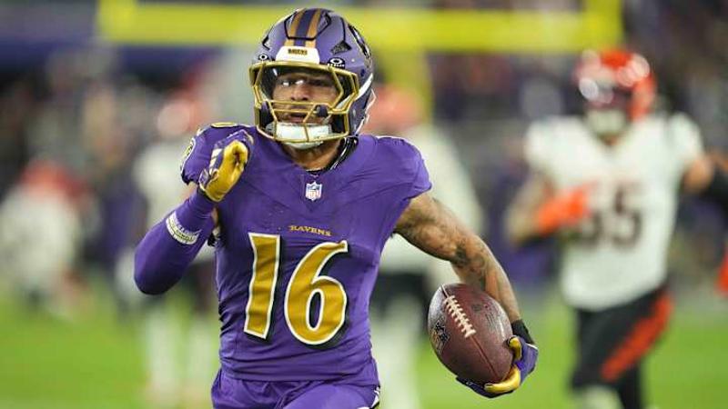
The Baltimore Ravens are entering their 30th NFL season with a relatively consistent visual identity. After an initial logo change due to a copyright dispute, the team adopted its current primary logo in 1999. Since then, the primary purple and white uniforms, along with a later introduced black alternate, have remained largely unchanged, despite occasional experiments like gold pants in 2015 and the "Purple Rising" alternate uniforms last year.
While Ravens fans appreciate the team's look, national opinions are divided. USA TODAY's Nate Davis ranked the Ravens' uniforms 25th in the league (an improvement over 28th the previous year). Davis criticized the black and purple colors as resembling bruises, though he praised the Maryland flag detail on the shoulder crest and acknowledged the "Purple Rising" helmet design attempt, ultimately finding the look underwhelming ("meh").
The article acknowledges that debating uniforms can seem trivial. However, it counters the criticism by arguing the Ravens have a solid overall look. They are one of only two NFL teams (alongside the Minnesota Vikings) using purple as a primary color effectively. Furthermore, the all-black alternate uniforms are highlighted for their significant intimidation factor, especially during prime-time games.


Related Comments(3831)